UX Consultant
UX Research
UX Design
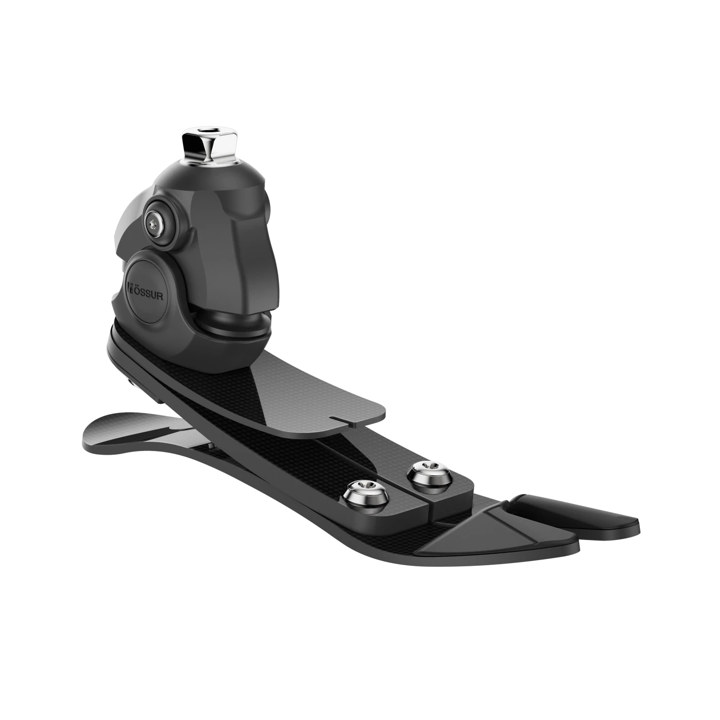
Ossur prosthetic device
Reimagining prosthetic experience through minimum invasive digital intervention for amputees that uses user centric approach. Goal is to “go beyond Mobility by empowering Lower-Limb Amputees”



Main
Projects
About
Awards
Testemony
Contact
Legal:
© 2026 GoutamPro
Rights & copyrights reserved.
Design
UX wireframes
Design System
UI Design
Content Strategy
Prototyping
Pattern Documentation
Prototyping
Behavior ANALYSIS
Mobilefirst approach

Phase 1
Patient’s App
150+ Screens Created
20+ Modules
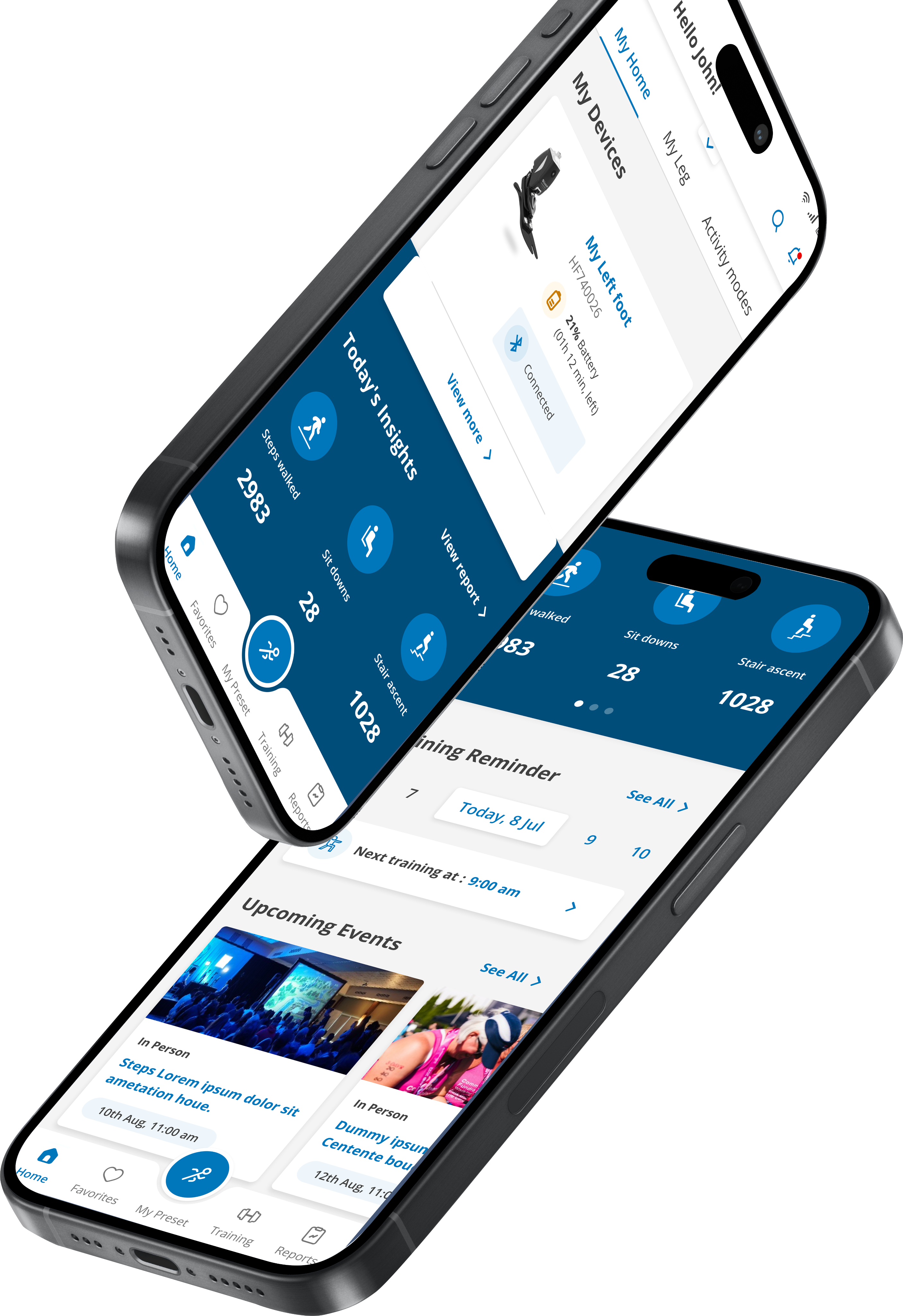
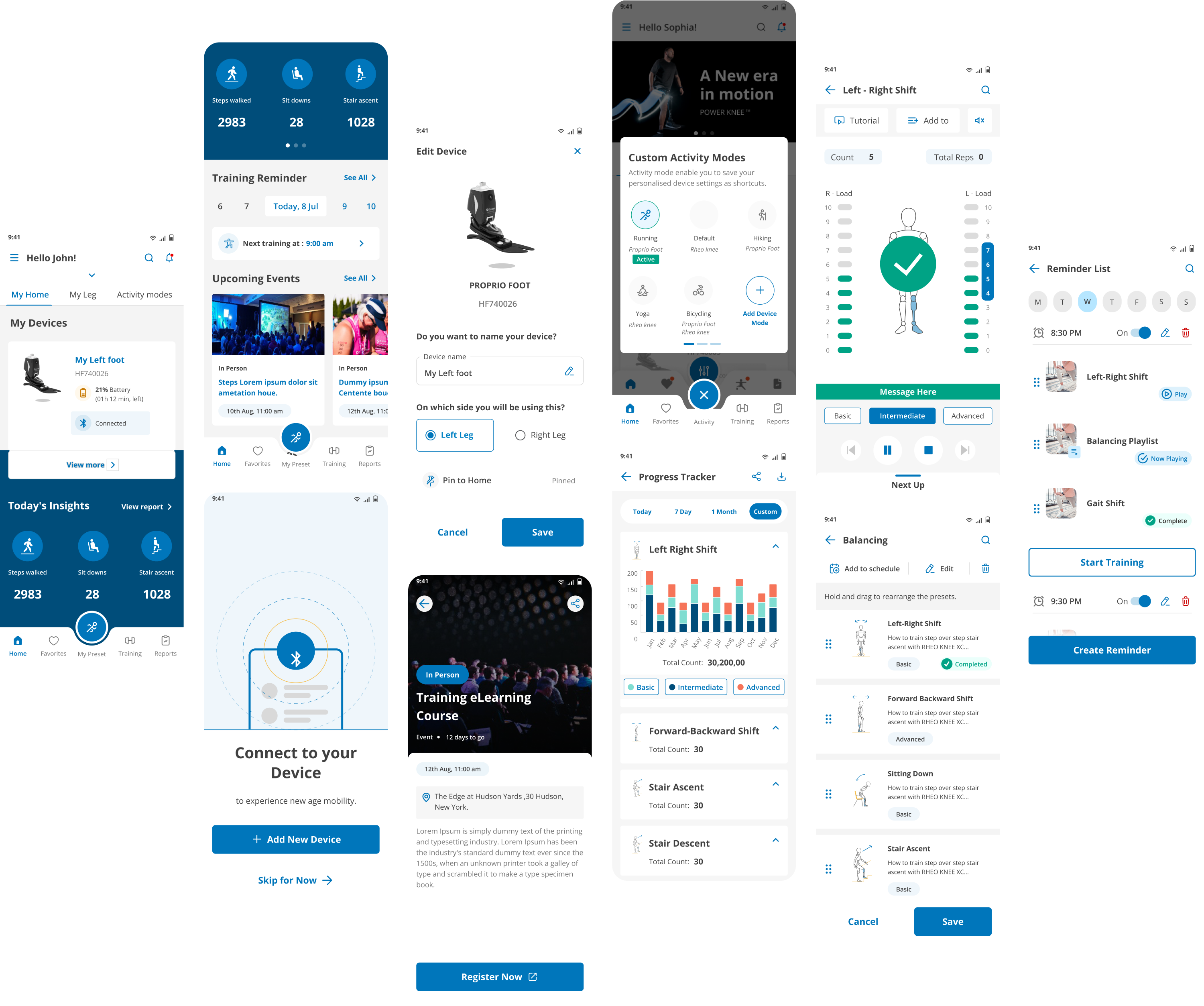


Project Highlight
- Received high performance appreciation letter and gift from the Harman
- Tech Maestro Award & Project of the year
Type
B2C

Tool
Device

Duration
Phase 1 : 9 Months
Phase 2 : 9 Months

Patient’s App (Phase 1)
Empower amputees to reach their full potential and have increased control over their daily life where they not only adapt, but thrive.
150+ Screens Created


Clinician’s App (Phase 2)
To provide a seamless, user-friendly experience for healthcare professionals during the setup and during the lifetime use of the prosthetic devices.
200+ Screens Created

About Client
- Our client has a prosthetic device company with impressive range of prosthetic lower limb and Upper limb. They have wide range of specialized department for technological development, Medical support, Training, Specialist academy etc.
- They have been focused and dedicated to improve life of amputees worldwide by making them feel confident and mobile. In continuation with the same intension, the client approached us to understand amputees and client’s system in-order to design innovative digital experience for the lower limb amputees.
Project Brief
- Reimagining prosthetic experience through minimum invasive digital intervention for amputees that uses user centric approach. Goal is to “go beyond Mobility by empowering Lower-Limb Amputees”
Team Structure
- TEAM : *UX Consultant . UX Designer . UI Designer . Business analysts . Project manager
My Role

Research & Design
As a consultant, I served as a dual-role UX researcher and designer. I also actively contributed to the visual design approach and design system’s consistency across applications.

Management
Managed and collaborated with diverse stakeholders and cross-functional teams, emphasizing the importance of integrating various perspectives for a holistic solution within the project constraints.

Strategy
Leveraged research findings and behavioral analysis, substantiated service offerings, and guided key business decisions, ensuring a user centric and strategically informed design.
Project Planning
Feature Prioritizations
Estimation
User INTERVIEW
User Testing
Design System
User Journey Flow
SUS Testing
Behavior ANALYSIS
Visual Design
IA

UX Approach
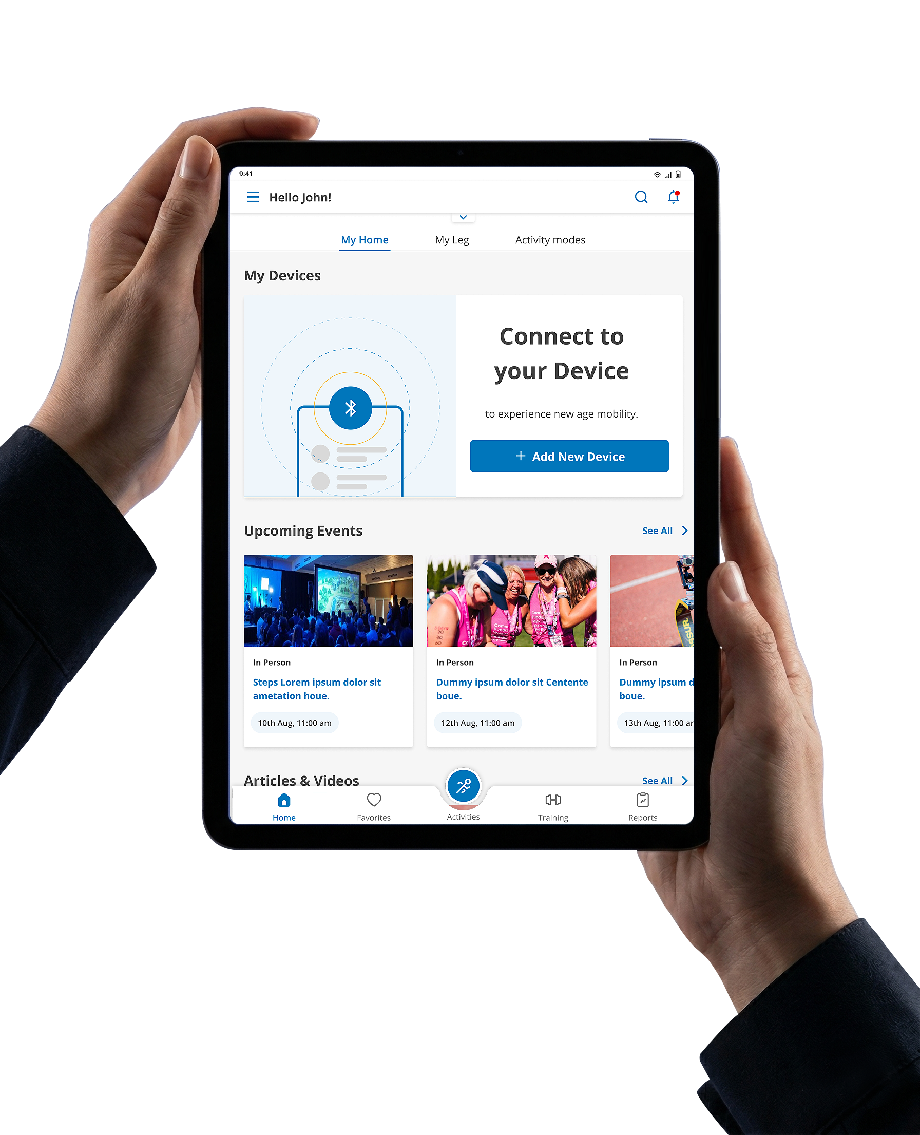
The project employed a two-phase design approach, creating dedicated mobile and tablet applications for both patients and clinicians. This ensured a tailored experience for each user group, addressing their specific needs and functionalities..
Through the Double Diamond design process, we embarked on a journey to deeply understand user needs. This led to a systematic exploration of core issues and exploration of potential solutions, which were rigorously tested through usability sessions. This iterative process allowed us to adapt and continuously improve throughout the project. As a result, the user experience that delivers satisfaction. The new design is not only simpler and more secure, but it also aligns seamlessly with user expectations.
Double Diamond Design Process


Define
Design
Research &
Discovery
Problem
Defination
Solution
Exploration
Designing
Milestone 2
Prototype &
Test
*only done for
patient’s app
Feedback &
Refinement
Milestone 1
Prototype & Test
Delivery
Research


UX Strategy

User Testing


Design System

Information Architecture
Design System
Project Timeline
Phase 1
Patient’s App
Total Duration
9 months


Research
Designing
M1
User
testing
Designing
M2
User
testing
3 months
4 months
2 months
Phase 2
Clinician’s App
Total Duration
9 months


Research
Designing
User testing + Feedback
3 months
4 months
2 months
1 Year 6 months

Research
To identify the most promising digital solutions, the project was kicked off with a structured 3 months sprint for both the Patient and clinician’s app
This phase combined :


Product walkthroughs & knowledge transfer

Stakeholder & Business understanding

Secondary research

User interviews & analysis

Feasibility assessments

Feature priortisation
The sprint culminated with a rigorously discussed features and possibilities with stakeholder from key departments to mitigate risks.
Purchases device via clinician
Provides Demo and Support
Helps in rehabilitation exercises
Prosthetic device manufacturer
Sets up prosthetic device


Part of clinician team
End User
Amputee

Clinician End User

Client

Physio-therapist

Client’s Specialist

Stakeholders

Primary Research
Analyzed current App

Patient’s App

Clinician’s App
Comprehensive user experience (UX) audit of the existing application was conducted, which helped in user interview preparations and analysis of user feedback.
This process helped us identify areas where users encountered difficulties or frustrations, such as: Confusing navigation, desired features or irrelevant information.
SWOT analysis
PATIENT’s App
Used SWOT analysis in the early stage to asses client's current position and identify new areas of improvement.
This framework helped in making : Understanding bigger picture, Strategic decision-making

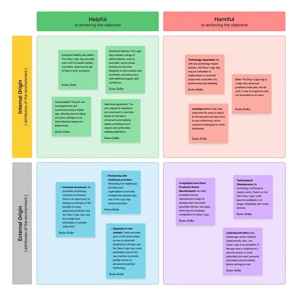
OLD research conducted by client

Clinician’s App
Analyzed old research conducted by client internally. This helped in widening our perspective as well as validating some of our research findings.
Competitor’s analysis
PATIENT’s App
Clinician’s App
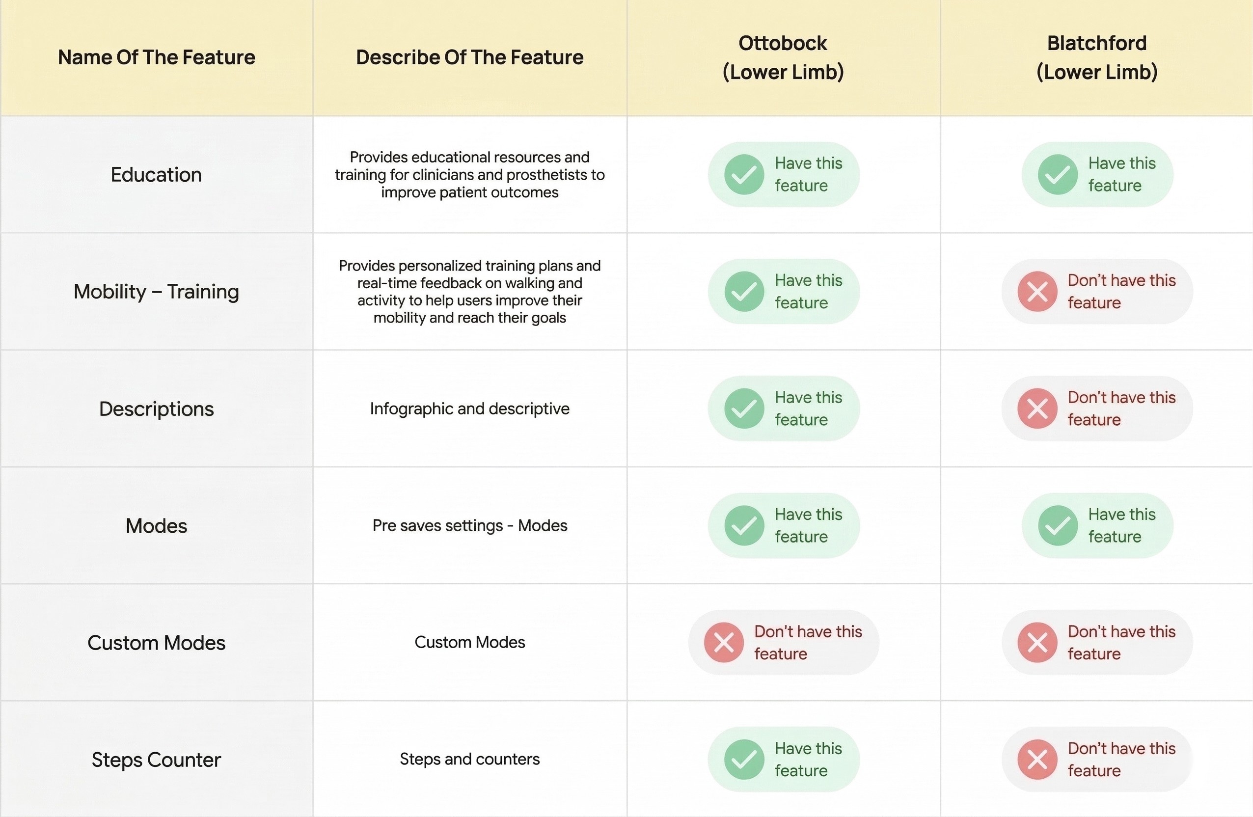
Competitor analysis helped unveils existing prosthetic solutions, user experience trends, and helped differentiate design proposal.
Identifying Gaps, Benchmarking, Competitor’s weakness.

Literature review
PATIENT’s App
Clinician’s App
Conducted a literature review to gain insights from existing research on mobile app accessibility for amputees.
Few take away :Clear and concise language, Color contrast, Large, high-contrast text, Large touch targets, Offer multiple ways to access information etc
Secondary Research
User Interviews
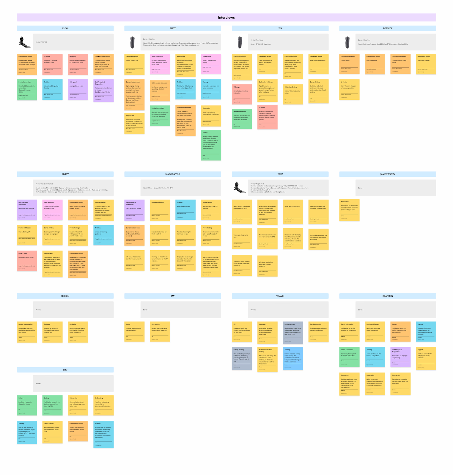
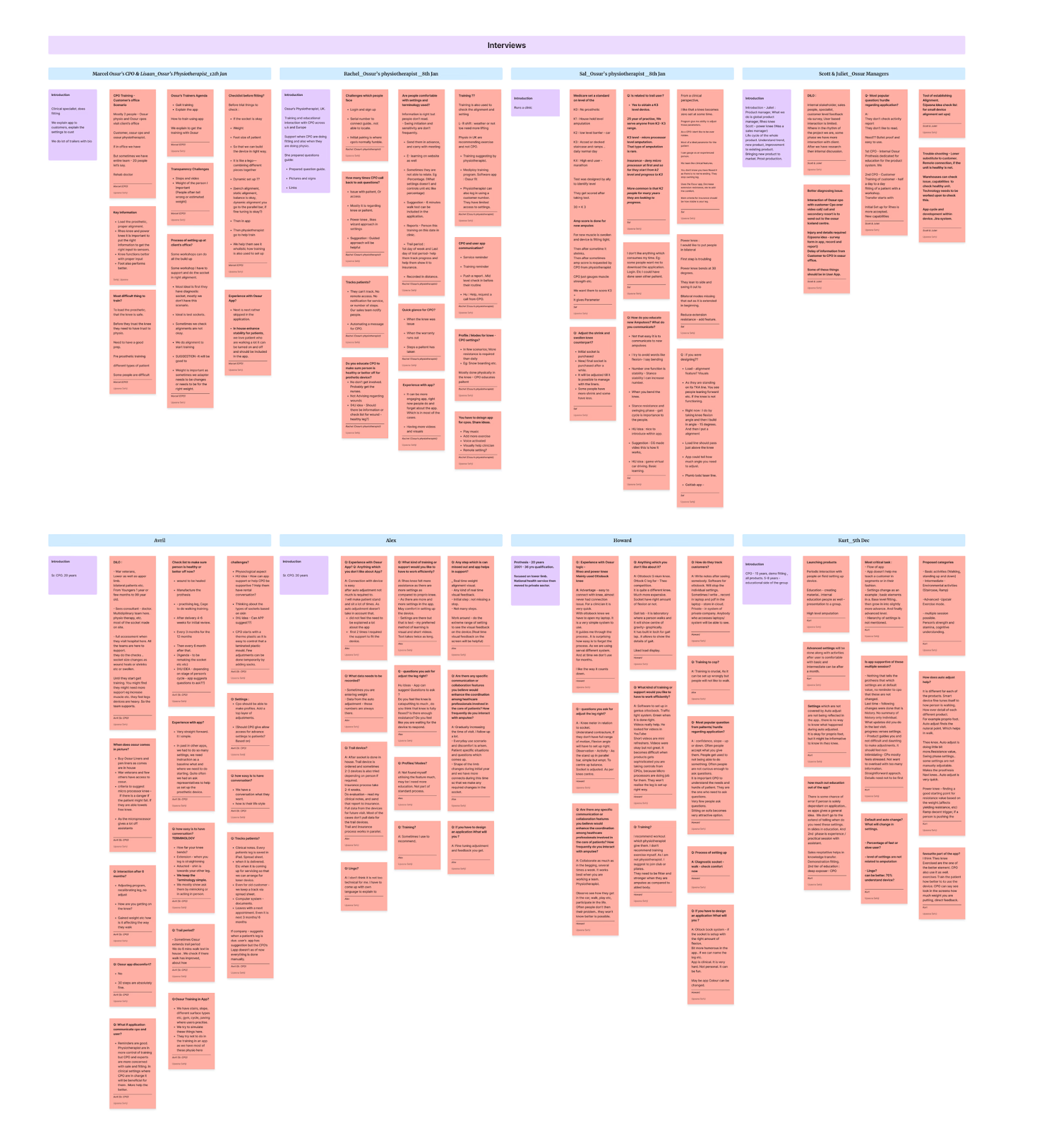
A cornerstone of the UX research process, aim of the research was to have deep understanding of our target users to be able to make informed design decisions.
Phase 1
Patient’s App
Total Interviewee

14
11
Amputees
3
Clinicians


Phase2
Clinician’s App
Total Interviewee
9
7
Clinicians
2
Stakeholders
Research Synthesis
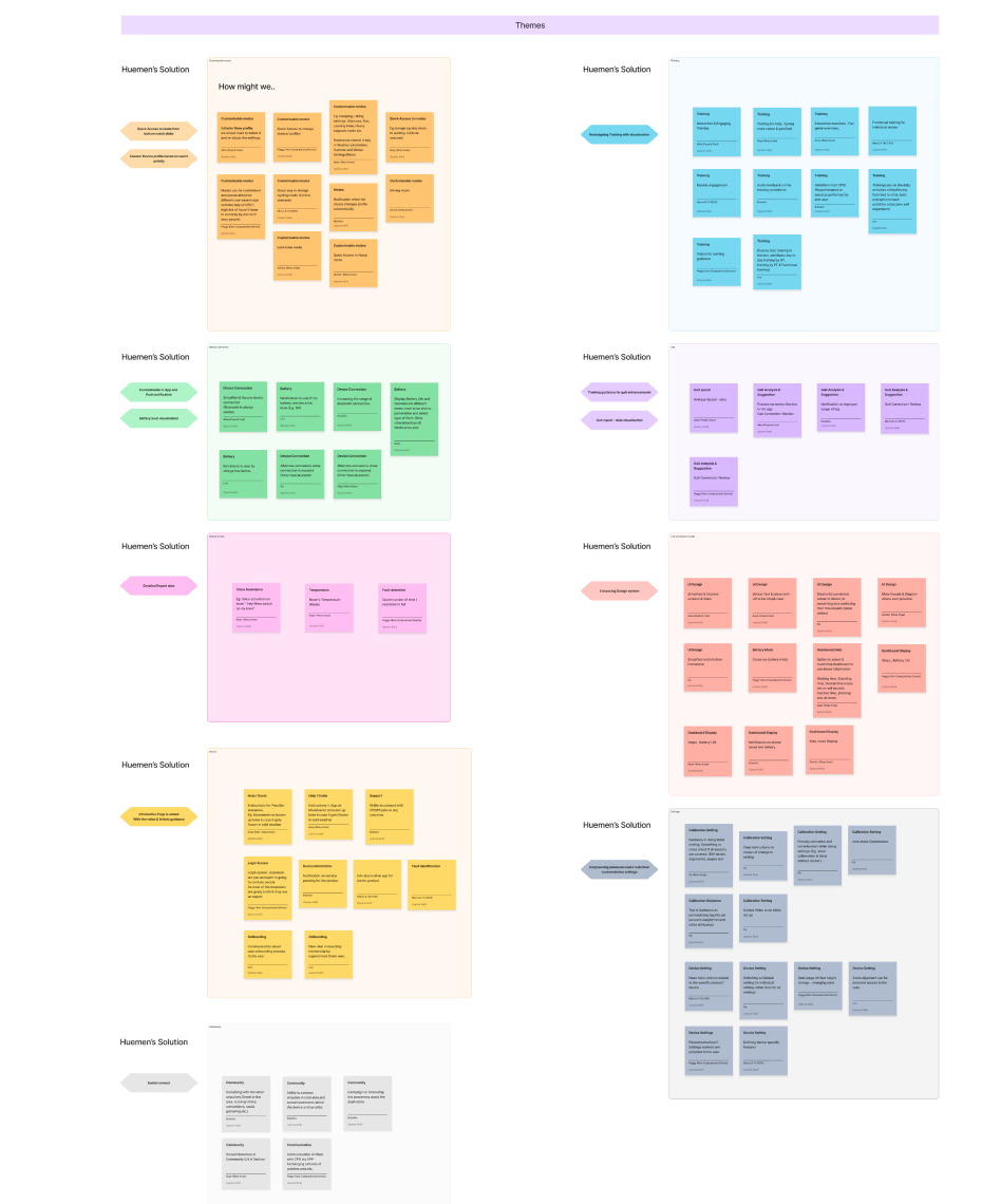
Data clustering and theming
UX Analysis
UX Synthesis
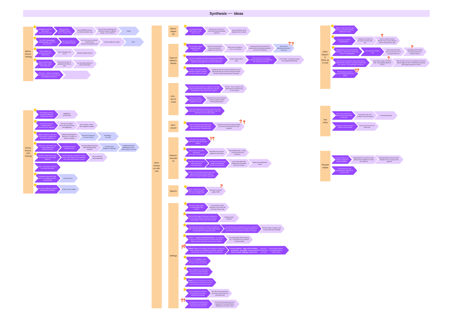
Consolidated feedback from user research and analyzed user reviews to identify following:
- Frequently mentioned issues
- Popular and critical features requests.
- Understand of the design direction
Phase 1
Patient’s App
Phase2
Clinician’s App
User Journey
USER FLOW
UX RESEARCH
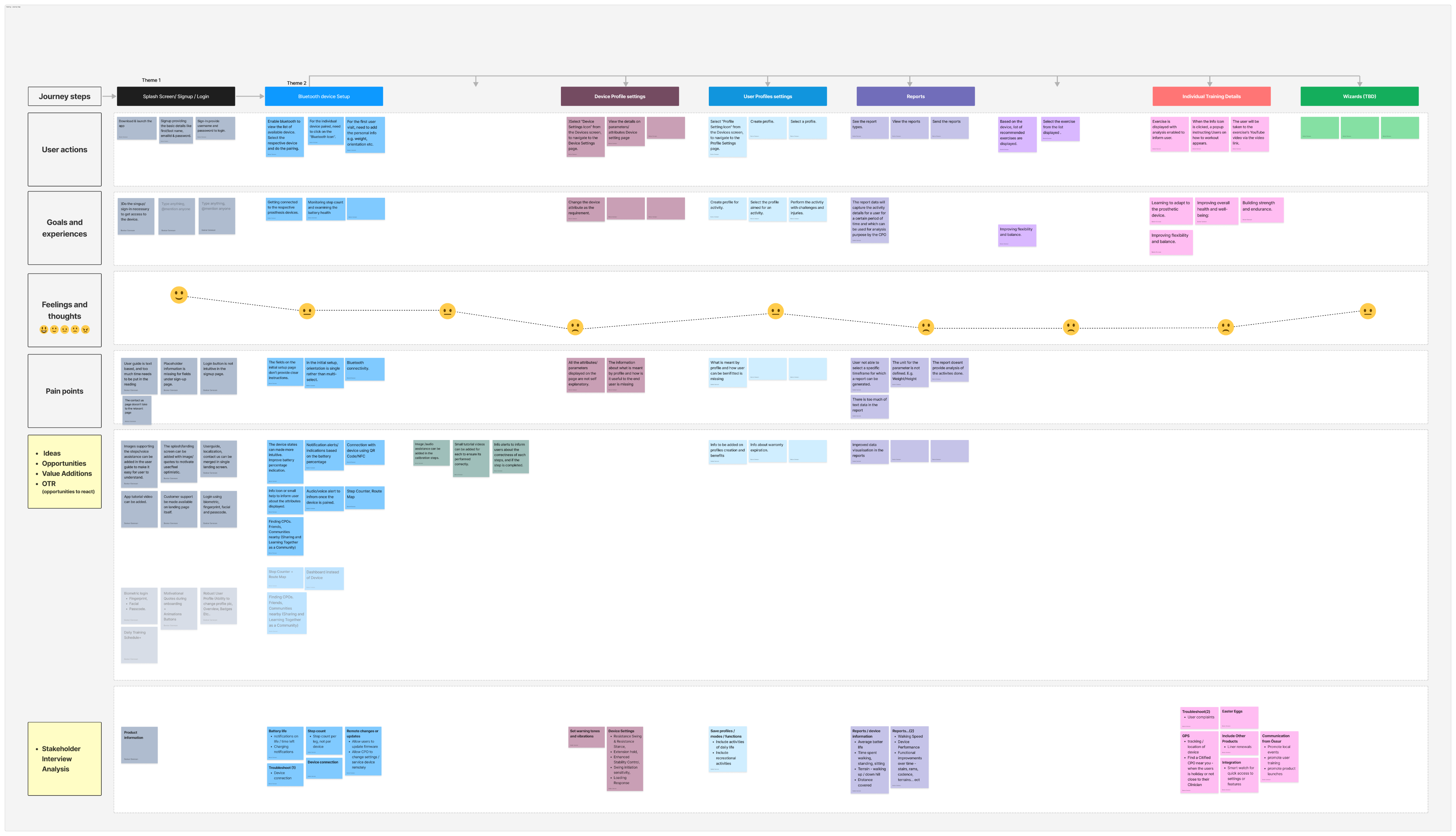
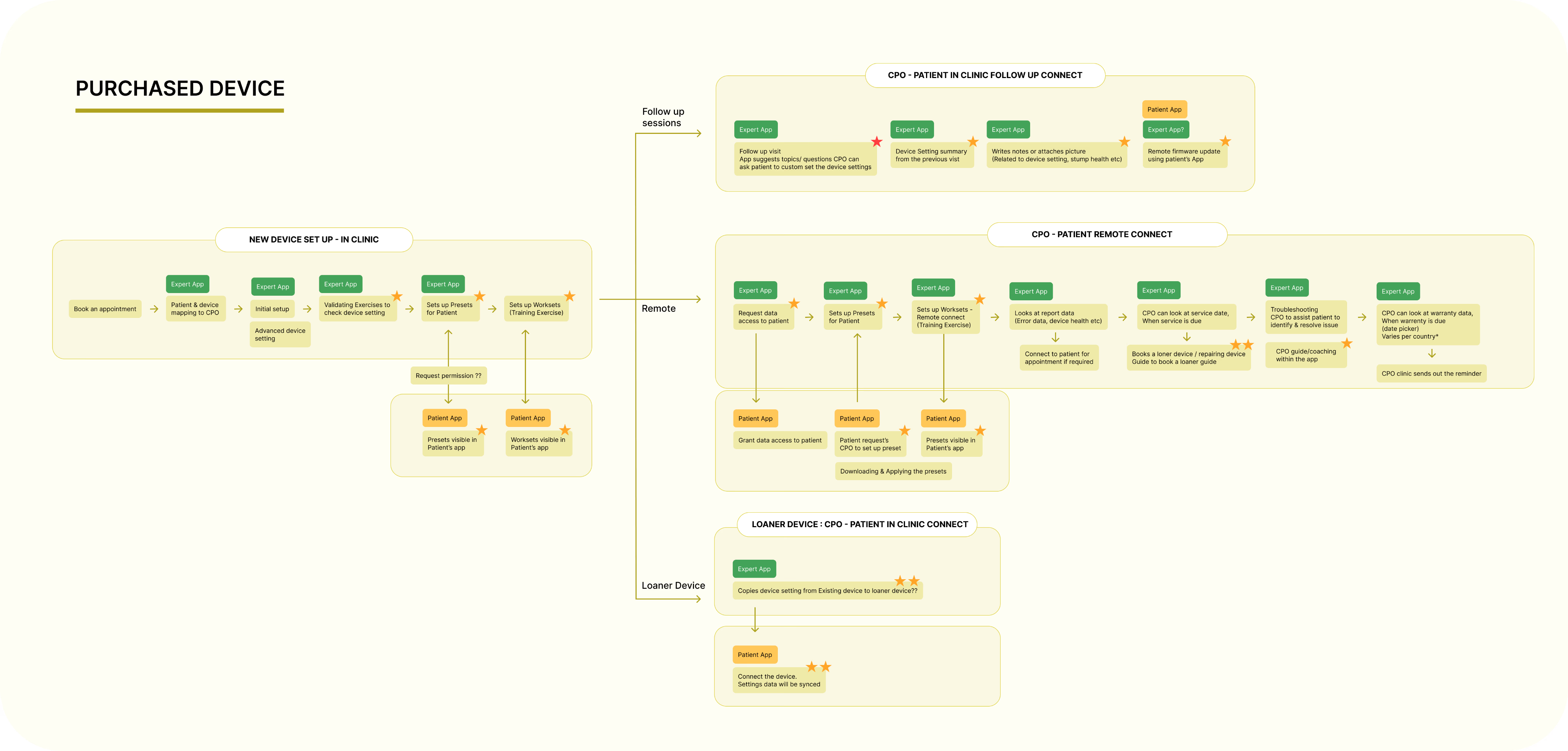
The above data from patient’s app audit and user research was then mapped into User Journey Map. This helped us in identifying the following :
- Potential additions and improvements in the current app’s flow
- Patient’s and Clinician’s app interaction
- Visual representation of flow helped in discussion with client and stakeholders
- Helped in discussion on business needs
Phase 1
Patient’s App
Phase2
Clinician’s App
Define
Key Identified Features
Phase 1
Patient’s App

Stats Visualisation
Enhancing feature most loved by Patient; various stats and reports.

Quick Access to settings
Settings are changed quite a few times in a day, which needs to be smooth experience.

Engaging Training
Training was found out to be one of the most crucial yet ignored aspect in the app.

Design for Older Adults
Majority of the users are Older adults, the app design needs to be inclusive.
Phase2
Clinician’s App

Scannable Content
Aim is to focus and send more time with the patient more than the application.

Patient Related Data
Patient’s information such as Warranty, Service etc, should be easily accessible.

Default Settings Identifier
Clinician’s found it difficult to keep track of modified and default device settings.

Prominent Visuals
As settings are most crucial aspect of the app, the visuals needs to be loud and clear.
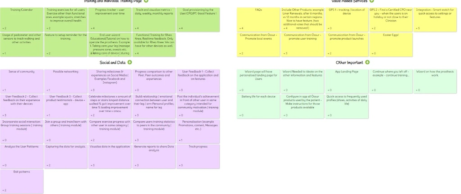
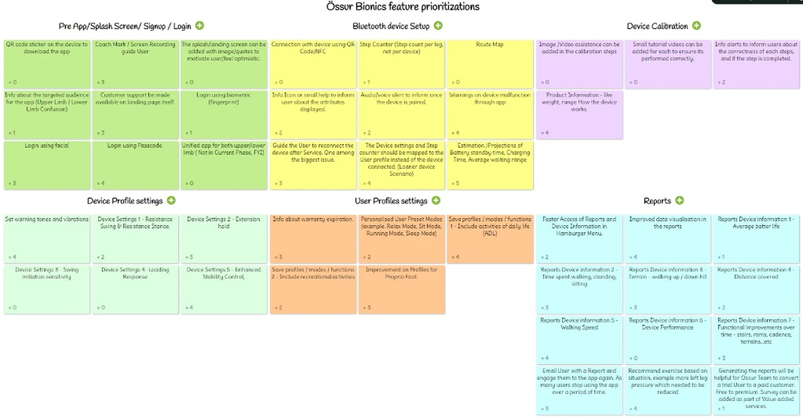
Feature definition & Priortisation
Votes were taken from all the key stakeholders on the consolidated proposed features. Client’s Stakeholders included were :
- Design manager
- Visual designer
- Development team
- Product owners
- Marketing team
- Internal clinician’s
- Industrial product designer
- Company’s CEO
This collaborative exercise helped prioritize features and helped us strike balance between user experience, development effort, Product capabilities and business goals.

Phase 1
Patient’s App

Phase2
Clinician’s App
Persona
It was found that there are total 4 key stakeholder; Patient, Clinician, Physiotherapist, RND team (Not considering in these phase)
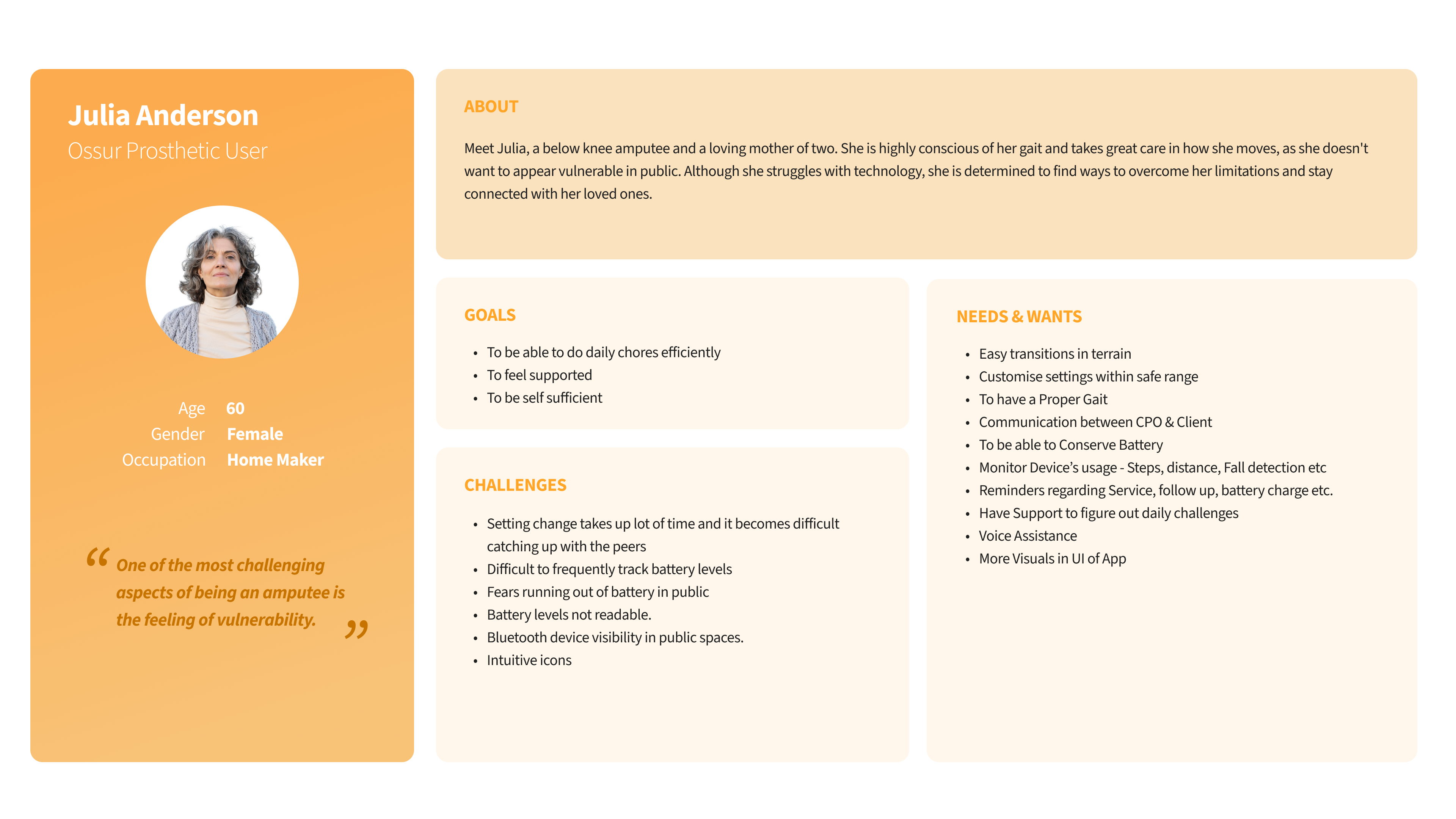
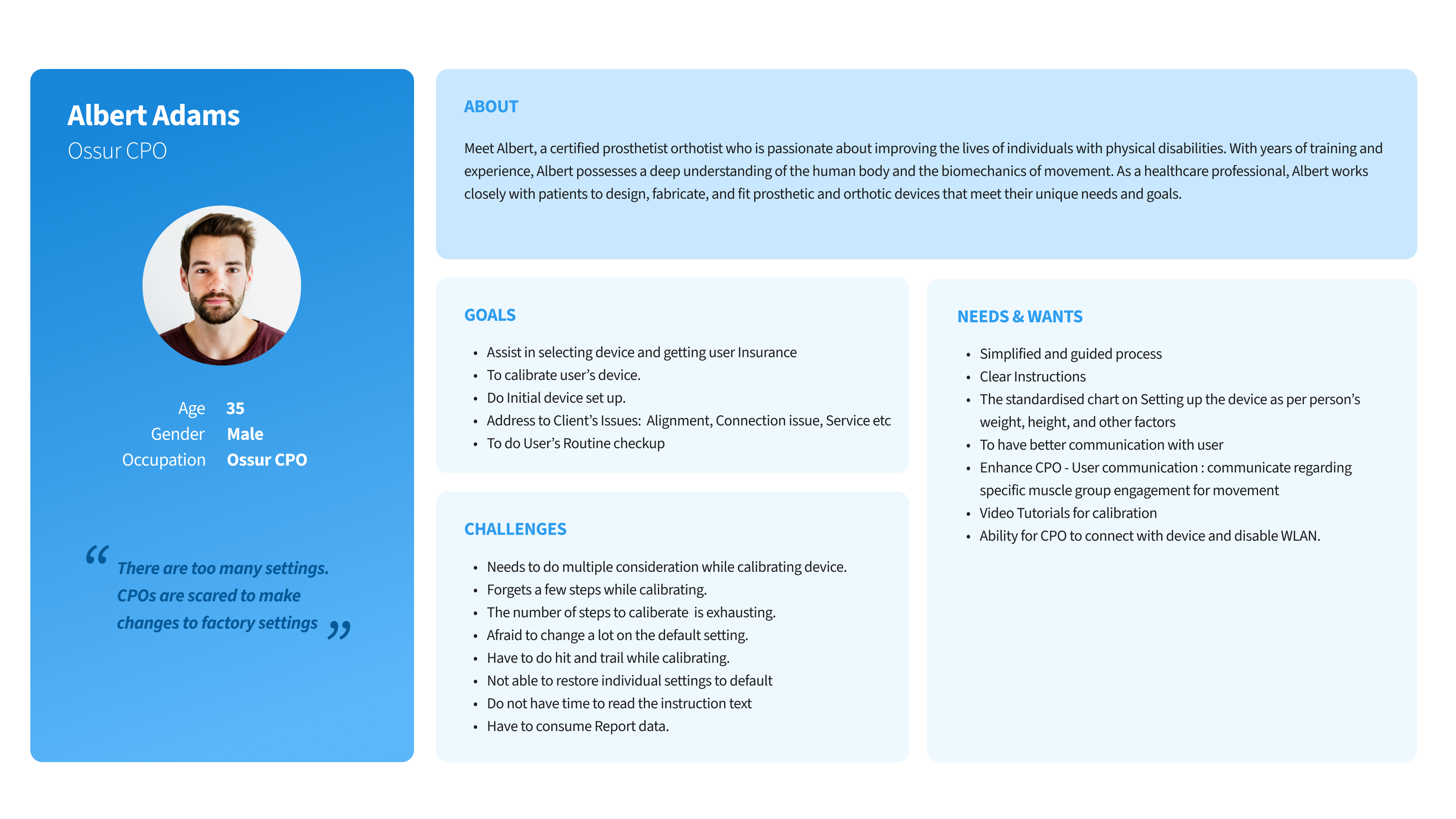
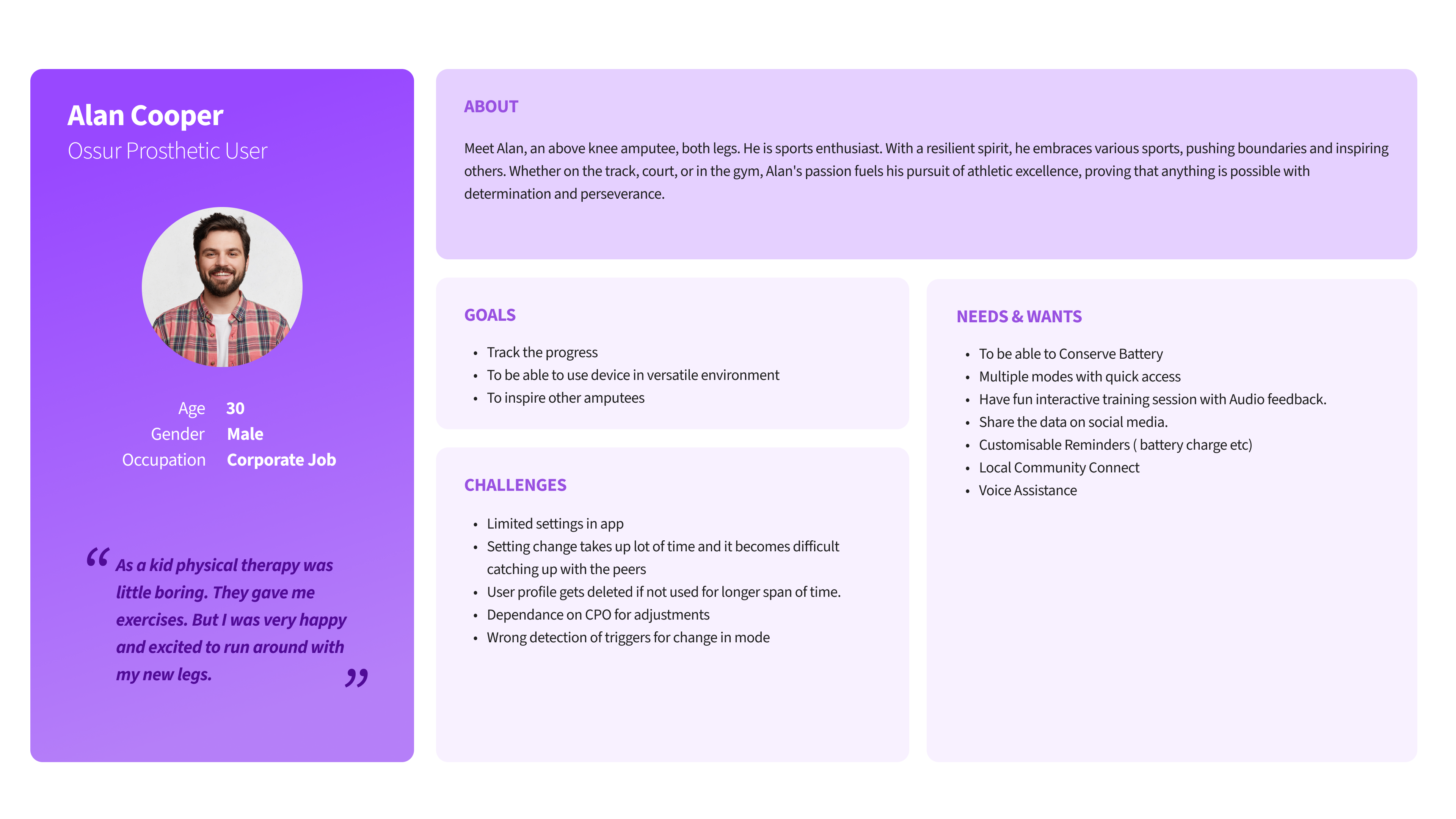
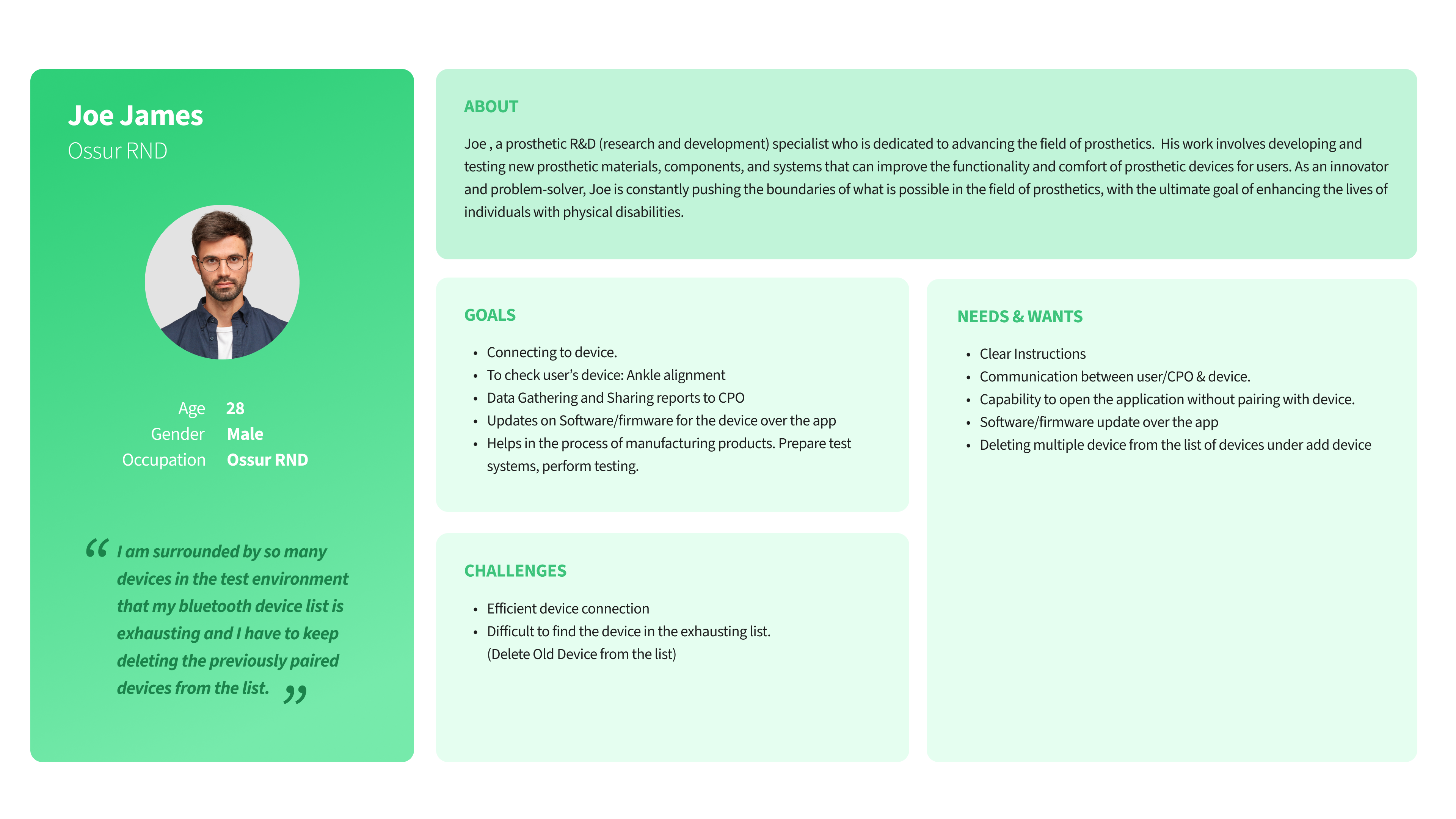
Understanding Problem: Personas
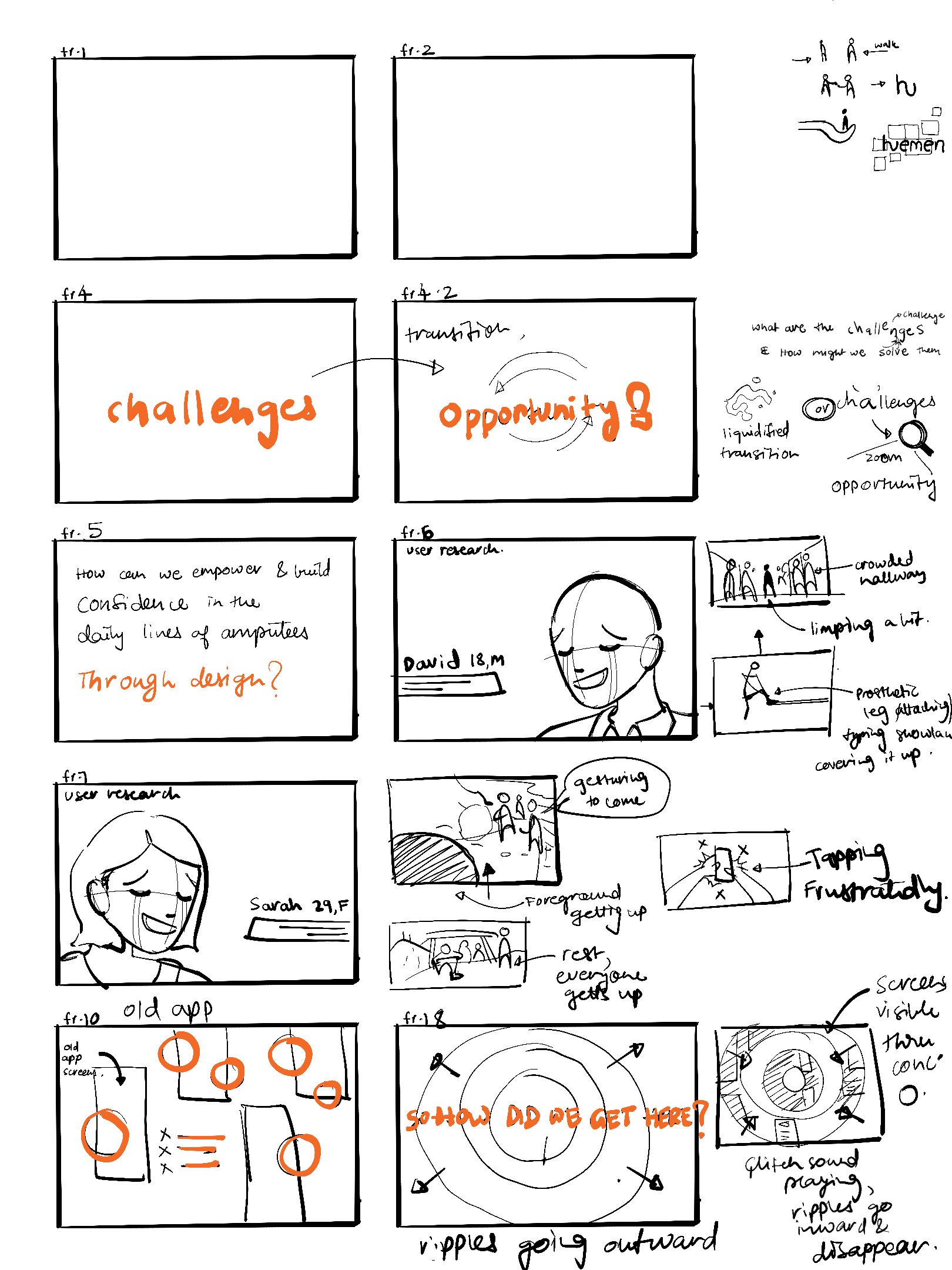
1. David : 20 something man with knee amputation
“I used to feel proud and confident, but now I feel self-conscious when I walk because I think everyone is staring at me due to my awkward gait. One of the most challenging aspects of being an amputee is the feeling of vulnerability. ”

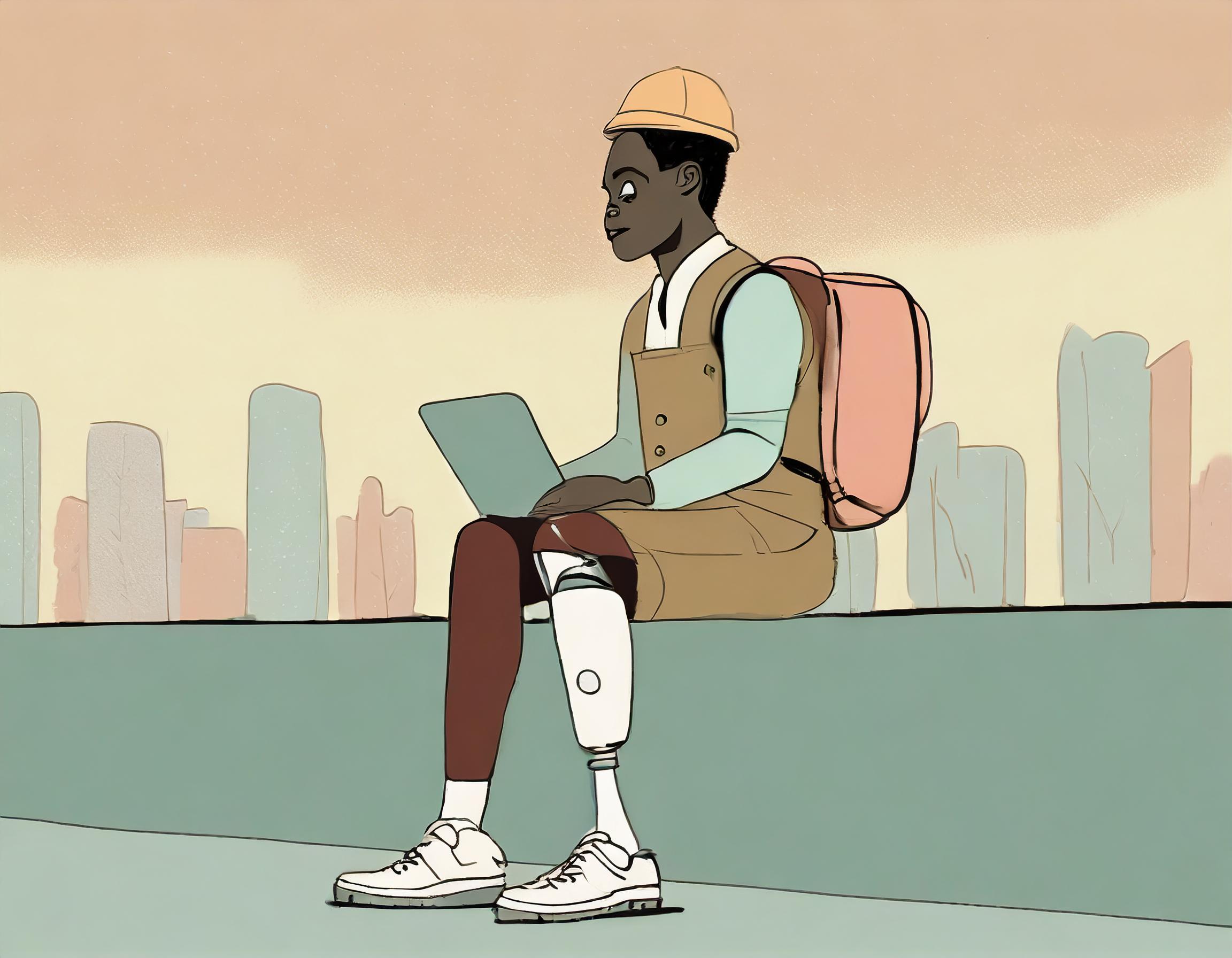
2. Sarah : Dedicated Hiker with foot amputation
“ I love to move freely between trails and terrains. Everyone refuels in a flash, but switching gears with my prosthetic takes a while, especially with my heavy rucksack. I Just wanna get moving quickly again. “


Information architecture

Process
Interim review and validation from internal clinician’s and subject matter experts
Design Approach

Home page behaves like a hub to access all the important information.

Introduced Fixed top and bottom navigation for quick access.

Crucial to do content grouping based on user needs and logical reasoning.

Introducing shortcuts to have smooth workflow experience
and more.
Phase2
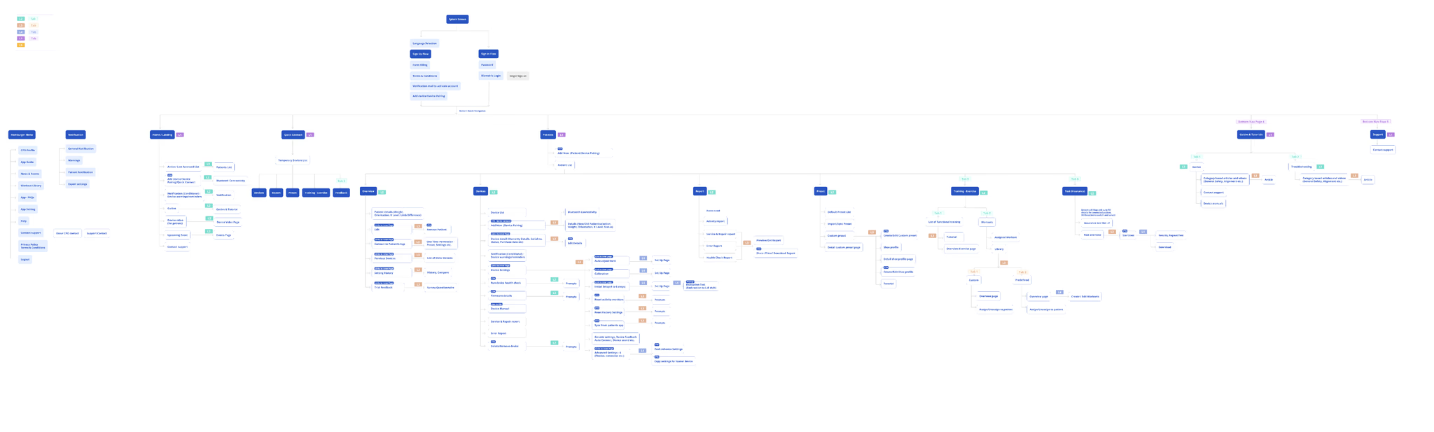
Clinician’s App - Information architecture
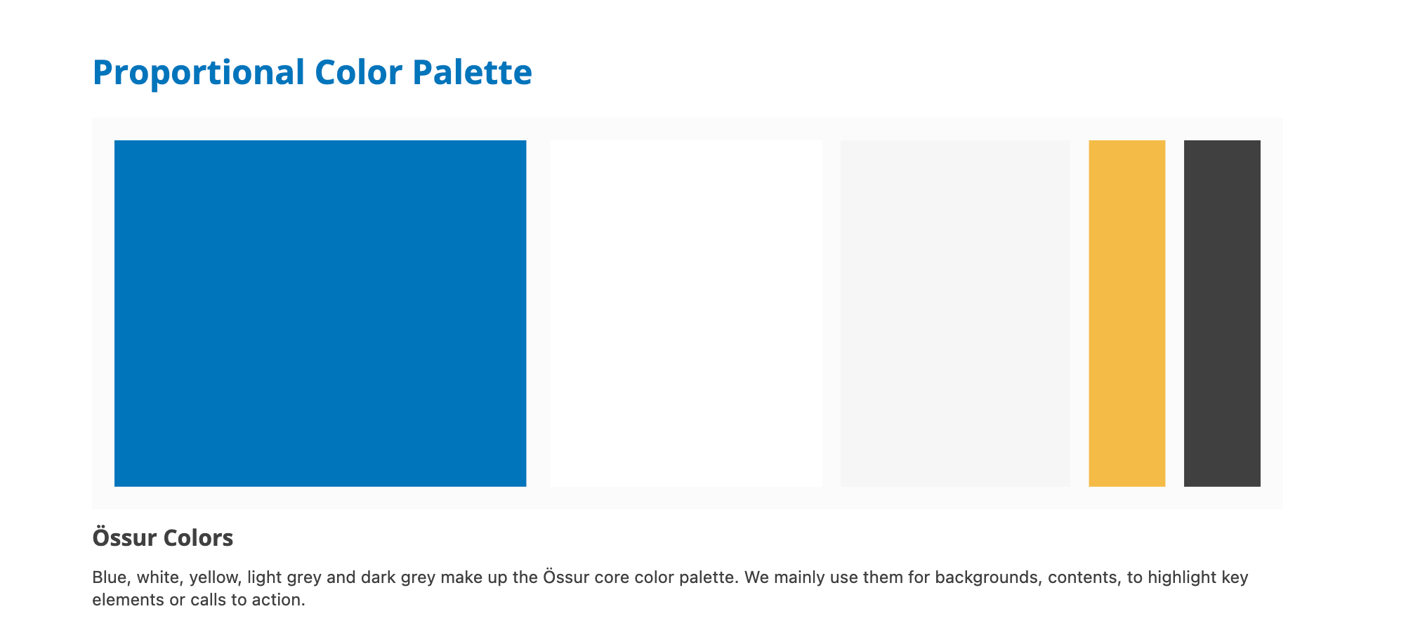
Design System
Primary - Tints
Secondary - Yellow
Text
Background
Borders
Icons
Neutral - Dark/Light Grey


COLOR PALETTE
#FAFAFA
Light Grey 3
Light Grey 2
Light Grey 1.5
Dark Grey 2
Dark Grey 1
#F6F6F6
#DCDCDC
Light Grey 1
#BFBFBF
G500
G400
G300
G200
G100
#767676

G600
#404040
W0
#FFFFFF
White
#FAFAFA
#F6F6F6
#DCDCDC
#BFBFBF
G500
G400
G300
G200
G100
#767676
G600
#404040
W0
#FFFFFF
#FAFAFA
#F6F6F6
#DCDCDC
#BFBFBF
G500
G400
G300
G200
G100
#767676
G600
#404040
W0
#FFFFFF
#FAFAFA
#F6F6F6
#DCDCDC
#BFBFBF
G500
G400
G300
G200
G100
#767676
G600
#404040
W0
#FFFFFF
#FADEA3
⭐
#FDEED1
#FEF8EB
⭐
Y600
#F5BC47
#D29933
#F8CD75

Y500
Y400
Y300
Y200
Y100


Paragraph
Heading
Text


Border 2
Border 1
On Grey Bg
On White Bg


Disabled Icon
Default Icon


Background layers
Name
Hex
RGB
B500-Ossur Blue
#0076BB
0,
118,
187
Fail
Fail
Pass
Pass
A
A
A
A
Name
Hex
RGB
Y500-Ossur Yellow
#F5BC47
245,
1188,
71
Fail
Fail
Pass
Pass
A
A
A
A
Name
Hex
RGB
G600-Ossur Grey
#767676
64,
64,
64
Pass
Pass
Pass
Pass
A
A
A
A
Default

Default

H1
H2
Subtitle 1
Subtitle 2
Body 1
Body 2
Caption
Input field / Label
Links
Links
Links
Links
32 Px
24 Px
20 Px
18 Px
16 Px
14 Px
12 Px
14 Px
18 Px
16 Px
14 Px
12 Px
Highlights
Default Sub Title large,
Default Page Title.
Sub Title Medium
Highlights
Stronger,Sub Title Small,Highlights.
Stronger,Highlights.
Stronger,Highlights.
Label Text
Default ,More prominent
Medium prominent
Less prominent
Very less prominent
Large
Medium/Regular
Small
Smallest
Strong, Highlights.
Strong, Highlights.
Strong,Caption, Over line text
Default Paragraph, Body Text, Subtext
Paragraph, Body Text, Subtext
Default Caption, footnote
Bold-700
Bold-700
Bold-700
Bold-700
Bold-700
Bold-700
Regular -400
Bold-700
Bold-700
Bold-700
Bold-700
36px
30px
28 px
24 px
21 px
18 px
21 px
27 px
24 px
21 px
18 px
Semibold -600
Semibold -600
Semibold -600
Regular -400
Regular -400
Regular -400
24 px
21 px
18 px
24 px
21 px
18 px
Hero text
Size
Size
Usage
Tags
Bold-700
Weights
40px
40 Px
28 px
28 px
36px
30px
28 px
24 px
21 px
24 px
21 px
24 px
21 px
60 px
40px
24 Px
20 Px
18 Px
16 Px
14 Px
32 Px
Line height
Line height


TYPOGRAPHY
Font Family
Headings/Titles
Body & Caption
Links
Extras
Open sans - Elegant Versatility
Mobile
Tablet


Component
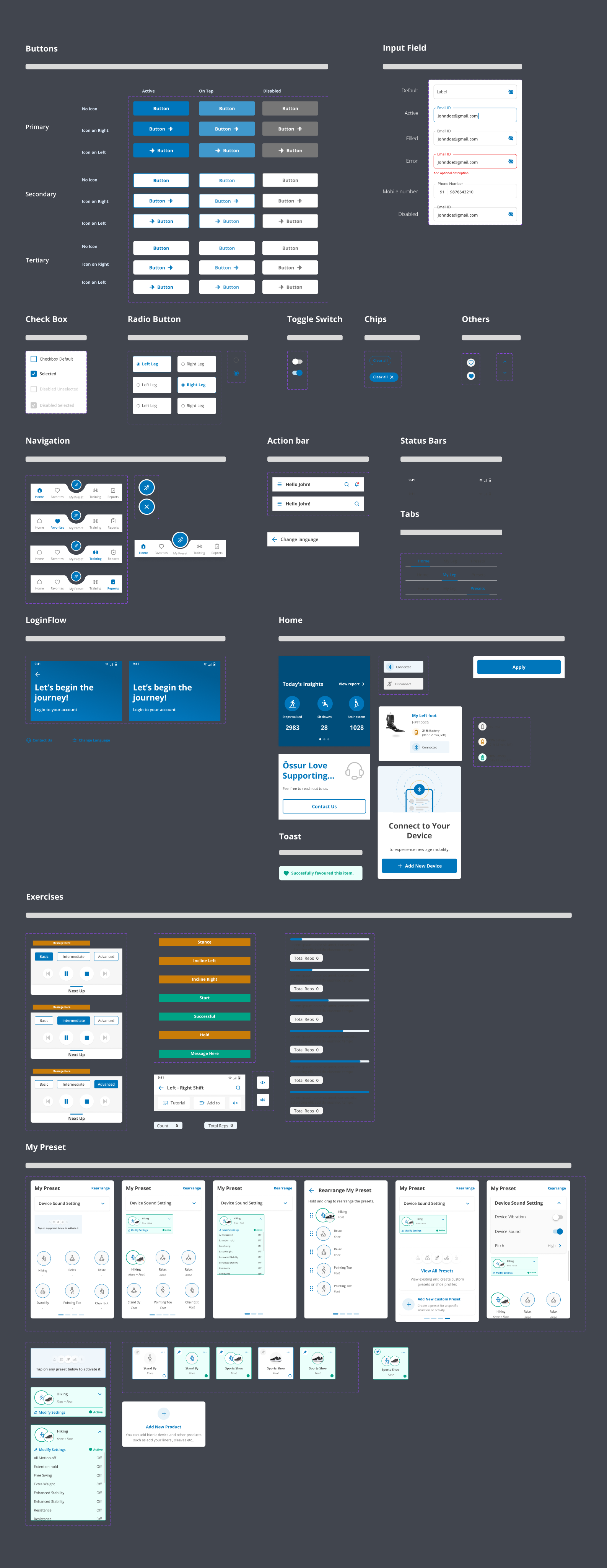
Design

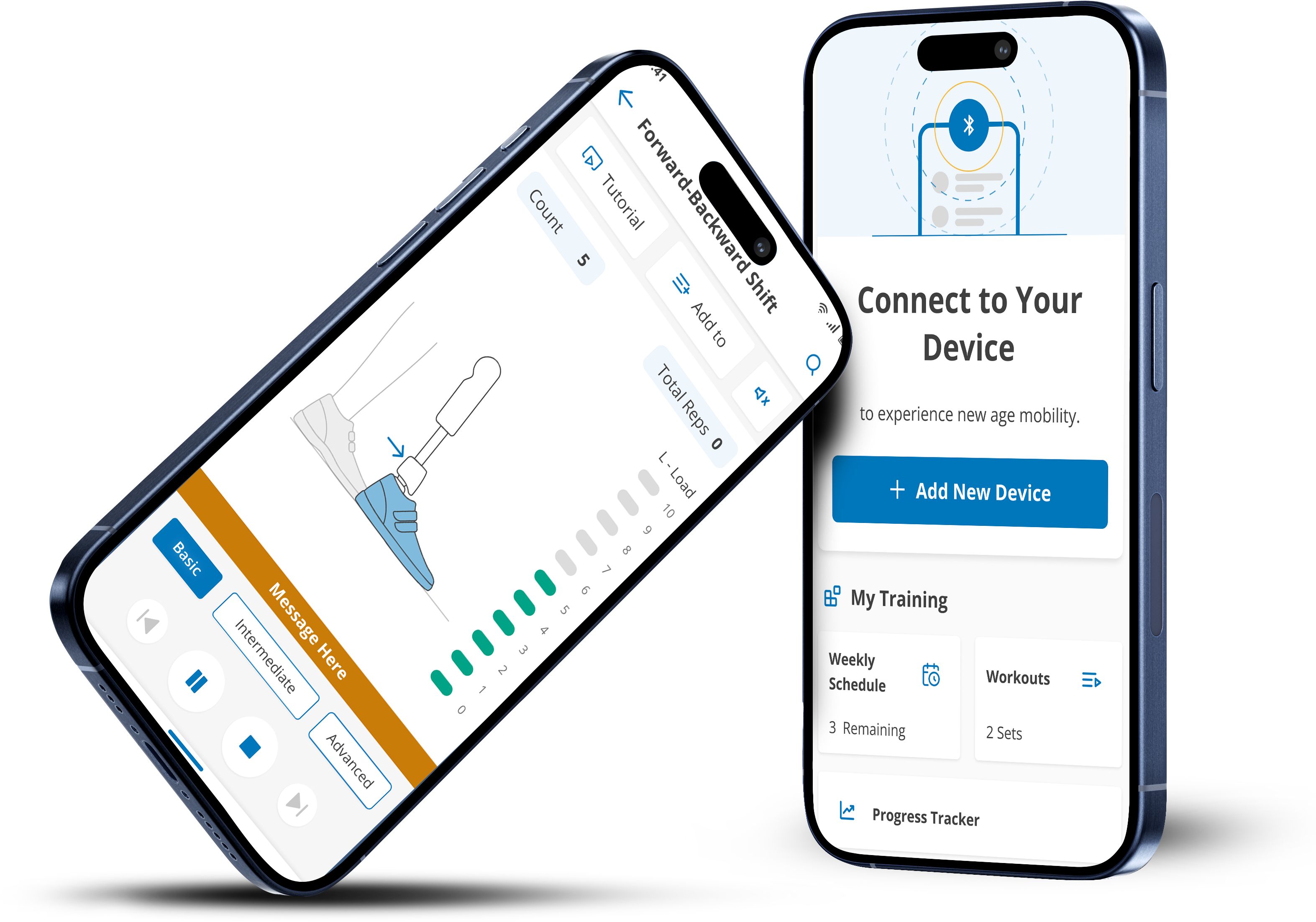
Mobile
As a consultant, I served as a dual-role UX researcher and designer. I also actively contributed to the visual design approach and design system’s consistency across applications.
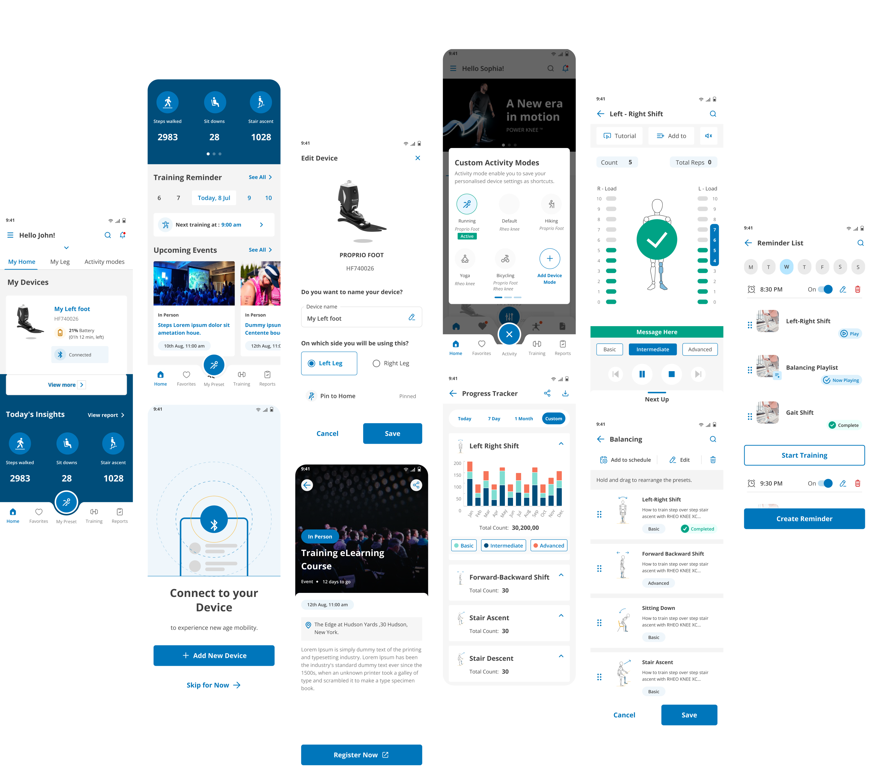

Tablet
Managed and collaborated with diverse stakeholders and cross-functional teams, emphasizing the importance of integrating various perspectives for a holistic solution within the project constraints.

Usability Testing
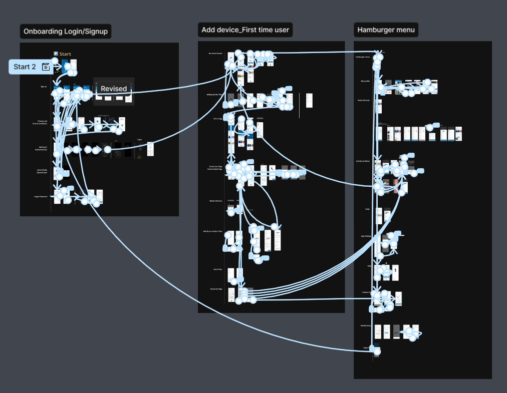
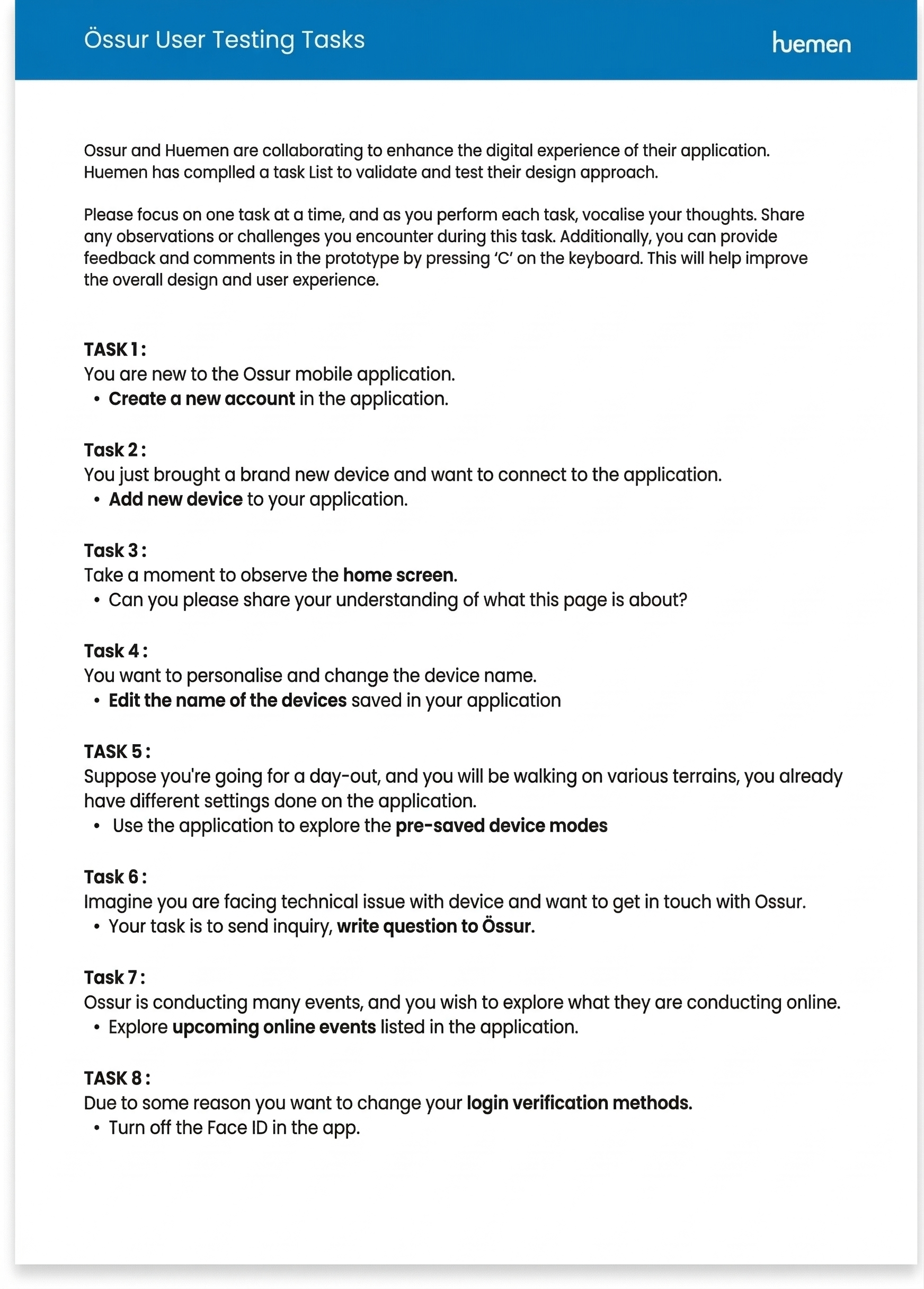
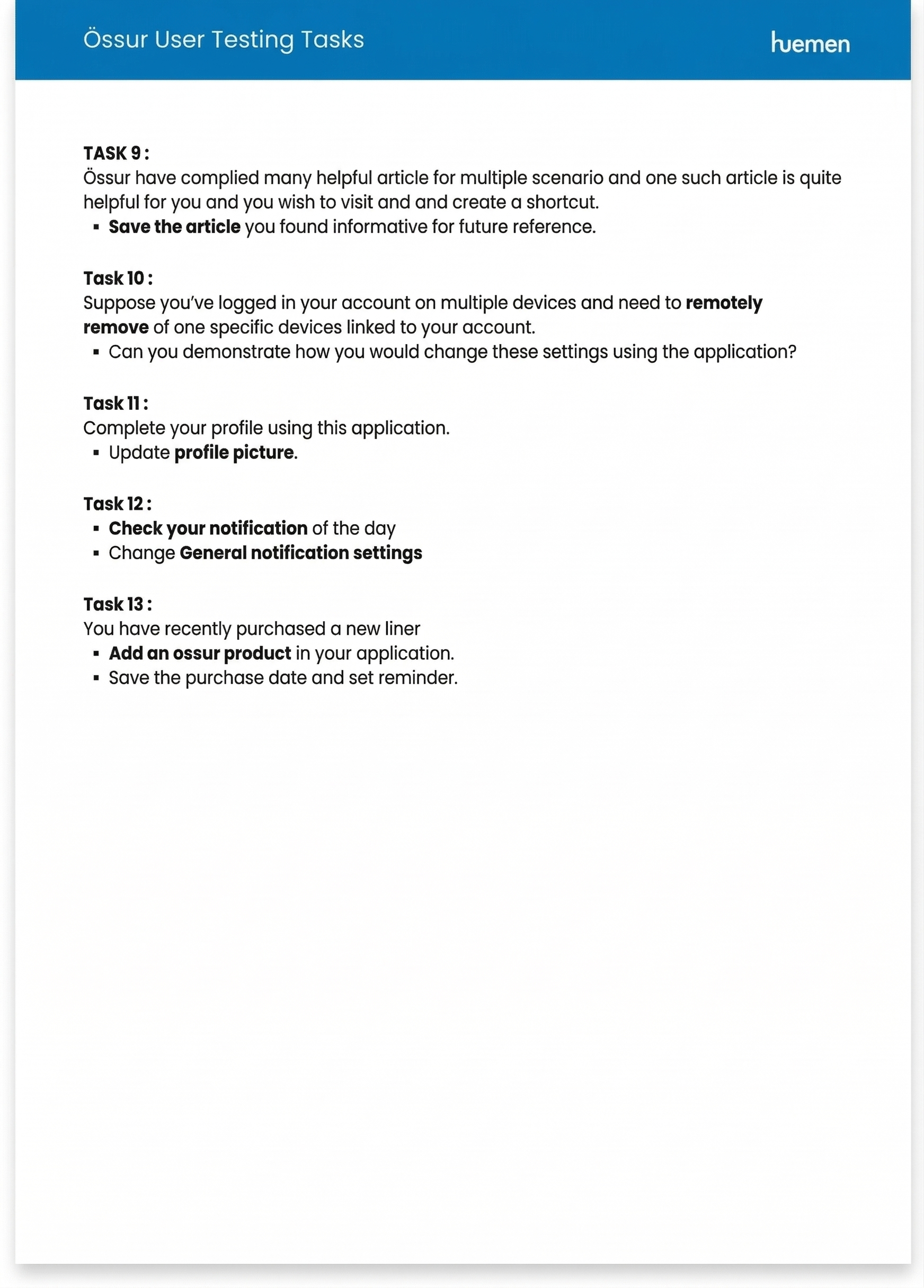
I single handedly spear headed the entire testing, task design, documentation and driving insight for both the application.
Total 3 tests were performed, 2 for patient’s app and 1 for expert’s app.
Testing gave us a lot of clarity on various aspects such as :
- Perception of the application
- Navigation
- Grouping and nesting of sections
- Visual design
- Mental modal of data positioning
- and more..
Task Analysis
Users were given tasks to complete within the app. This revealed inefficiencies in existing features and identified areas where workflows can be streamlined.
A/B Testing
Tested variations of features and section nomenclature to see which version performs better with users. This helped make data-driven decisions early on during the design phase before rolling the screens out for development.
SUS Testing
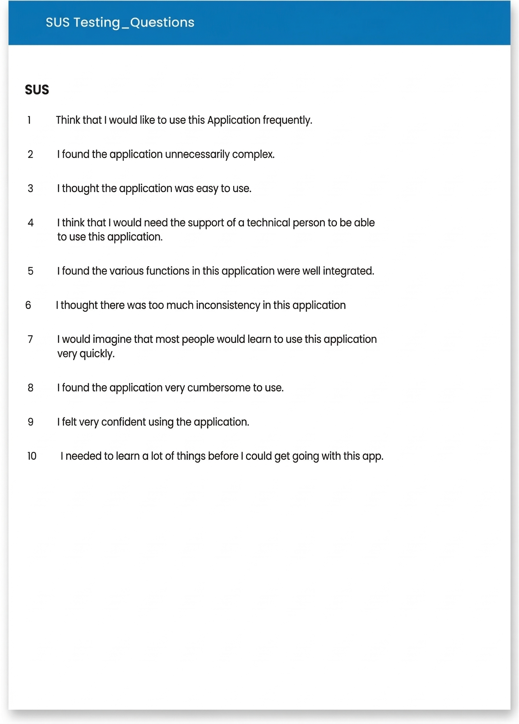
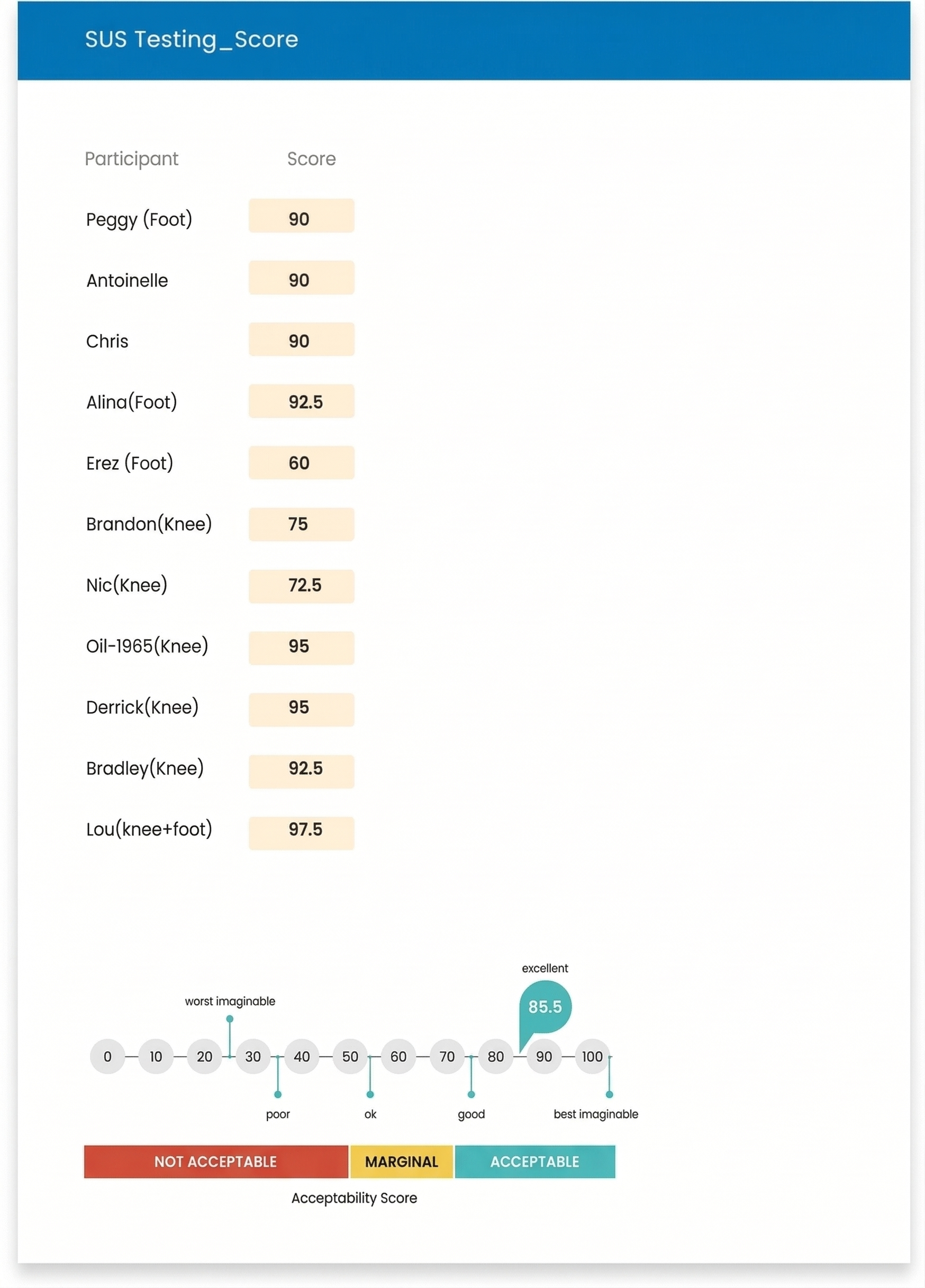
The SUS questionnaire covers aspects like the ease of use, the complexity of the system, and the user's confidence in using it. Once all responses were collected, the individual scores were converted into a total SUS score, which ranges from 0 to 100. This score gave a general indication of the product's usability, with higher scores representing better usability.

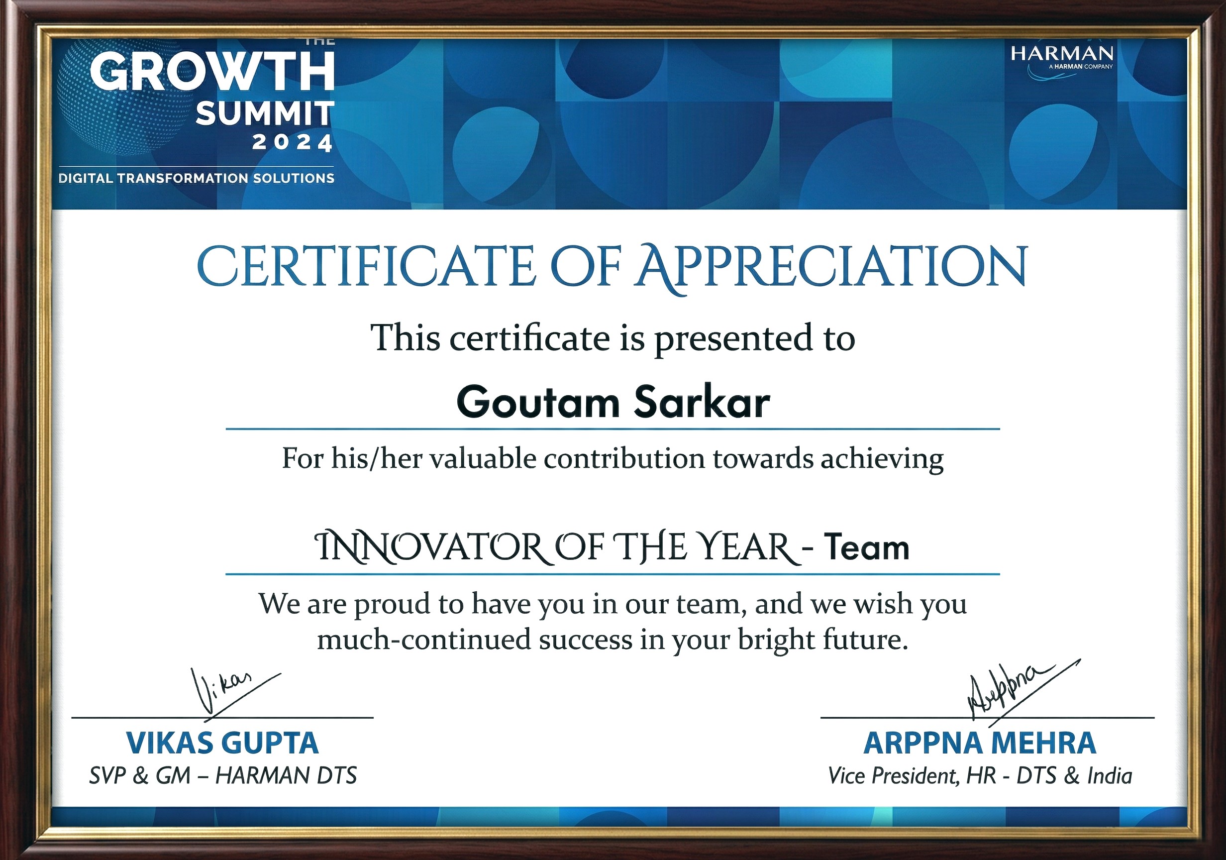
Awards & Recognitions
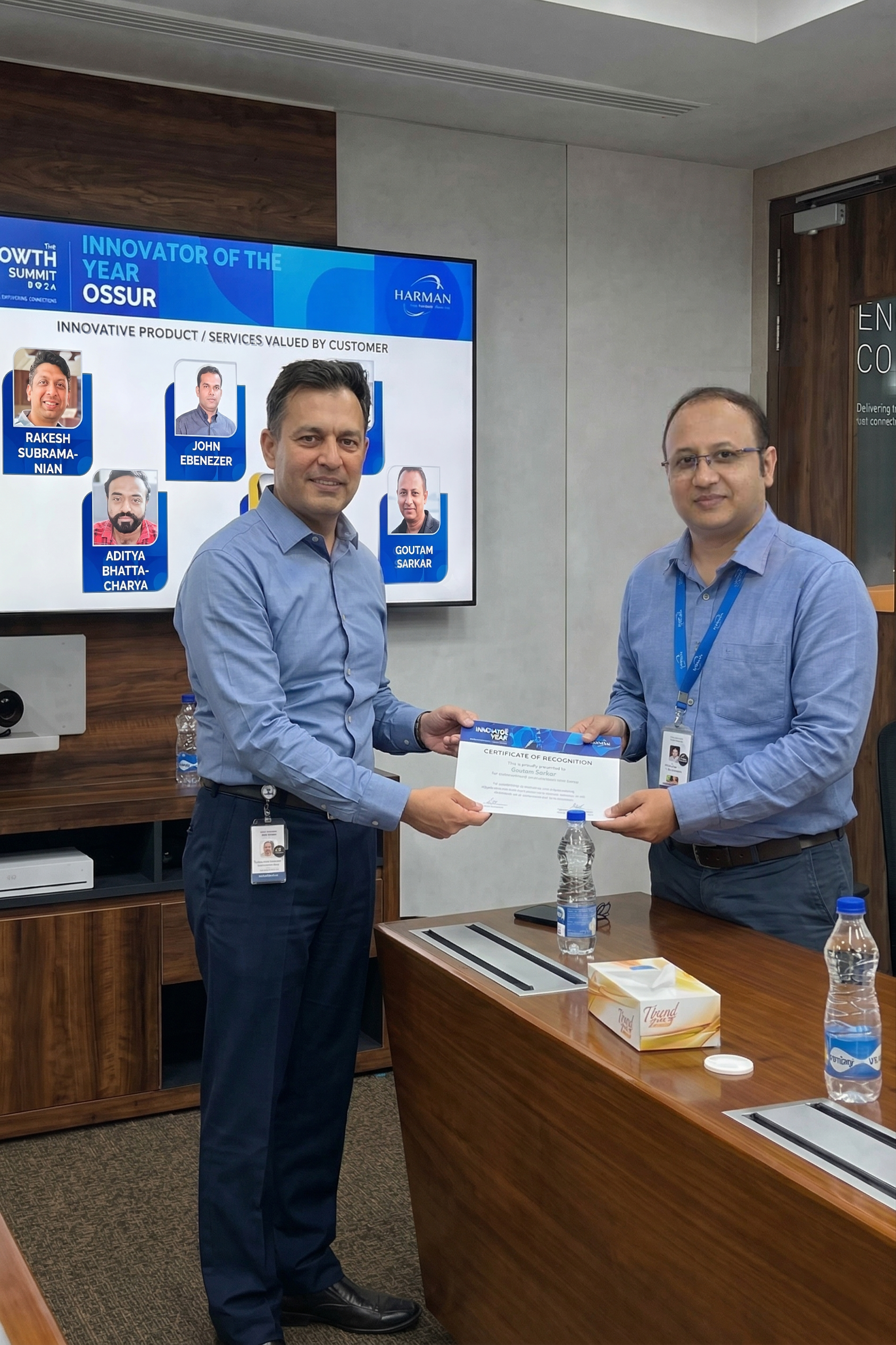
Award given by Harman DTS VICE PRESIDENT
Key Learnings
Conceptualizing
Communication with Stakeholder
Informed Decision-making
Effective Research Practices
Iterative Design Approach
Collaborative and Cross-functional Skills

Co-creating with different stakeholders and across cross-functional teams and the importance of incorporating their perspectives and inputs to design a holistic solution within the constraints.
Use research findings and behavioral analysis to back the service offerings and drive key business decisions.These are some of my many learnings in this a year and half long intense and fulfilling project.
